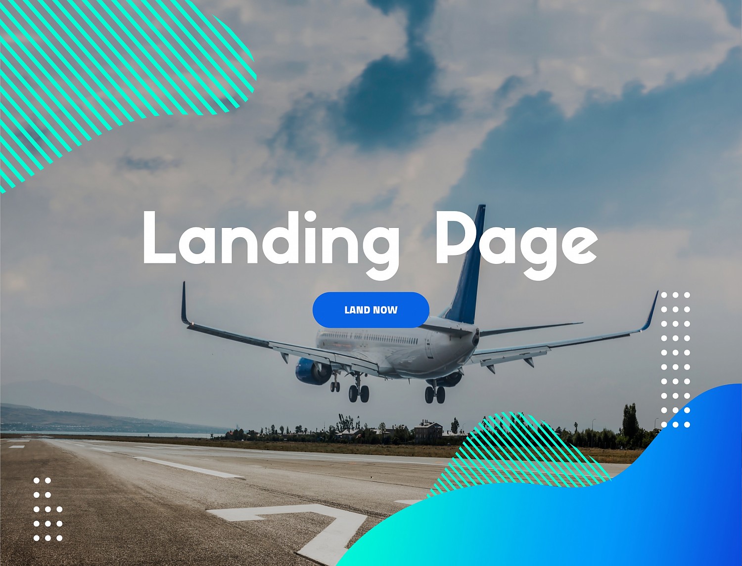
As the name implies, this is where we “land”, when we travel, we go from one airport to another to later visit the destination that we want to know so much. The landing page is the airport before getting to the city, that is the website. It is an arrival point where we can have a brief presentation of the brand, explain how it will work and convert or separate the “travelers” to stay at the destination soon. While the homepage needs to have everything for all visitors, lading pages can have very specific functions and requirements for each target.
There are several types of landing pages, two types below:
- Landing page 1 - a simple page that presents your brand
In this option, there is generally no main website yet, but there is already a desire to promote the project (without wanting to reveal too much), get feedback from the public and find potential stakeholders.
- Landing Page 2 - a separate page from your website, which may or may not have the same look & feel, oriented to a specific target
In this option there is usually a very well defined goal, such as a restaurant that intends to promote the new launch of a take-away service with available menu, integration with WhatsApp, order form and reservations. In this case, it is important to have a specific www to be able to quickly promote and promote this landing on social networks and others.
What are the main features of a landing page?
- Main navigation - Removing navigation forces the user to navigate the entire page, if it is simple and short the trip ends with the user performing the desired action on that page without distractions, just call toactions, for example, for a contact form.
- Simplicity - This is the key on any landing page. Contrary to what is expected by the visitor, sometimes we think that we can put everything on this landing page and have an “infinite” scroll, but this does not benefit the page. To simplify, reduce the number of design elements, use less text, include more negative space, and make sure that the page includes few offers or call to actions to simplify navigation.
- Short forms for the target - In general, the longer the application form, the lower the conversion rate. It is a good idea to include only the questions thar you really need an answer. Simplify the form so that the user spends as little time as possible completing it.
- Few texts - People have short attention spans. This means that the content we provide them needs to be easy to read. It's not that people don't read long texts, but they need to be able to quickly find the parts that answer their questions. A good practice will be to use bulleted and numbered lists, keep paragraphs short and don't be afraid to use bold or italic text to highlight specific keywords.
- Repeated the call to action - This is one of the most important parts of any landing page: make sure that the call to action appears more than once. You want to reach people the moment they decide to sign up or buy. If they must scroll to find a CTA, you could lose them. Don't make your landing page difficult for your visitor to use.
- Attract - As we know how to capture the user's attention, it means creating a fast, but lasting connection. Use strong images and intense colors and take risk different things for different targets … see what works best for your visitors and for your business.
Does your next project need a landing page? Maybe it's time to re-evaluate your users and create different landings for each target. All existing sites may need a new approach for new products or even to test new products or services still in the prototype phase - this division allows you to evaluate many more parameters for new markets and targets.
If you enjoyed this article, check also “One page site or multi page site?” it might interest you!
